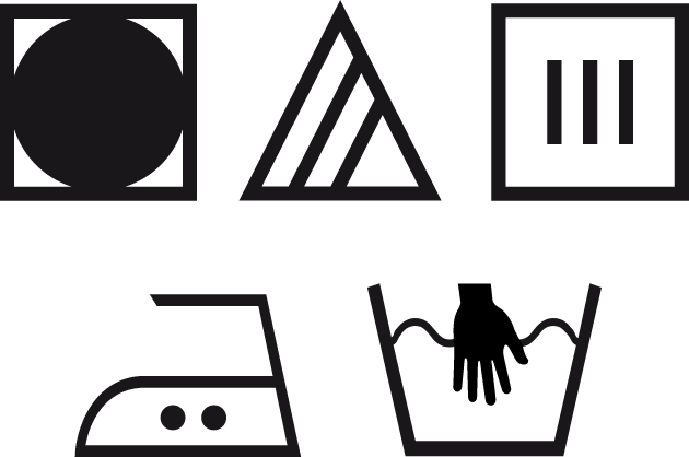
How many of these clothing care labels do you understand? I can guess the bottom right — hand wash, but others are Greek to me. Every time I do my laundry I debate whether it’s worth flipping through the 4pt type on the clothing tags, to correctly wash an item. Nah, no time, too much work. So I usually test my luck and hope I guess right. Well … that’s how I ruined my favorite pants!
This brings me to a critical question for all of us: Are we losing many prospects because we make them work too hard to get our message?
Whether it’s a logo, direct mail, an email, or a website, the primary goal of good design is the same: clarity, for quick communication. That’s why, when I start a project, I always aim for a strong statement of my client’s message with the least amount of content and design elements. My mantra for today’s “instant information” world: Less is More.
So now, let’s look at those laundry symbols again. They’re simple. They’re clean (pun intended). But some fail at instant interpretation … leading me to my next question: How can we make sure our creatives are easily – and quickly – understood?
My answer: Clarity Testing.
Basically, it’s asking people who are unfamiliar with the project to do a test run of your creative. This way, you can step out of your bubble and get an unbiased preview of how those in your target audience might respond to your team’s hard work. Benefit to you: You can tweak where needed now and possibly raise your ROI later.
Consider doing a Usability Test on:
WEBSITES: Usability Testing is a twin of Clarity Testing. The web development team observes people participating in a test drive of your website to answer questions like: Where might users get lost or confused? What information is actually being read? What engages enough for users to click through?
Consider doing a Clarity Test on:
LOGOS: When you present your design and tagline, take note: Can people understand in seconds (yes, seconds) what your company’s mission is? If not, pow-wow with your designer – pronto!
DIRECT MAIL / EMAILS: To up your response rate, give all your components a reality check: See how people respond to various elements. For example: calls-to-action. Do a few versions of the reply form, and test which gets the most attention.
Losing promotion dollars (or your favorite pants) isn’t funny. Want some free guidance in sorting out what can work for you from someone with proven know-how? I’m offering a complimentary 30-minute review of your future website, no strings attached. Contact me here. Happy laundering!
The laundry icons clockwise, starting at the top left: tumble dry low/cool; only non-chlorine bleach; drip dry; hand wash; iron medium temperature. To learn more symbols visit this webpage.
