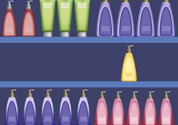
I was in a pharmacy today looking to replenish my supply of hand lotion. For an item so simple, there are so many choices. But what caught my eye the most was the one bottle of lotion on an otherwise empty shelf. There were other lotions to choose from, but those shelves were full. Suddenly my sense of urgency grew when a woman came and stood next to me — and patiently waited for me to choose. Now I had to make my decision —
“Oh no! If I don”t grab this bottle NOW I may lose out!”

Can you relate?
This is a everyday example of how visual cues and our emotions work to compel us to take action. We use the same techniques to elicit the same reactions in direct response creative.
Here’s how we do it. To elicit the “Oh no!” emotion with copy, we add phrases to our call to action like:
- Order now while there is still time!
- Don’t miss out!
- Time is running out!
- Offer expires XX/XX
But that’s only half of it. To be most impactful, you need to pair these phrases with specific design elements. Think of the bottle of lotion again sitting by itself on the shelf surrounded by empty space. There’s bold text on the package that was shouting out its benefits. If this same bottle of lotion had been placed on a full shelf with the competitors’ brands, I would not have noticed it as quickly and strongly
Now let’s apply this to direct response creative — how do you draw someone’s eye so they take action with a sense of urgency? Just like the lotion, surround it with white (empty) space, then add bold and color to the text to make it shout out.
Still, there is one more element we need to add to make the strongest impact: the arrow. I equate this arrow to the woman standing next to me, directing my eyes to the solo bottle of lotion. It is the “big push” to get someone to see the call to action.

Arrows can be big or small, colorful or not, even pointing fingers — but they all have impact. Why are they so effective? It’s because people’s eyes will always follow where the arrow is going.
If you are not already adding an arrow to your calls-to-action, try it. I am confident that it would benefit your creative.
